Cherryware
→ Product design & visual identity→ Fall 2017
About the project
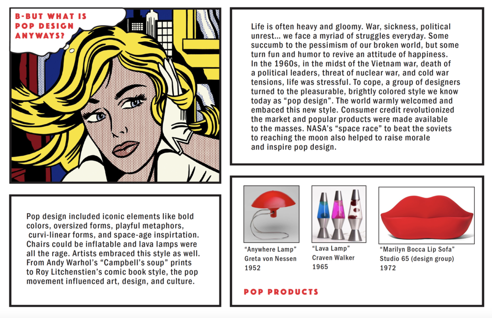
The goal of this project was to create eating utensils inspired by an influential art movement: Pop Art & DesignAs a lover of Roy Lichtenstein and Andy Warhol, I was excited to work on this assignment. I was able to combine inspiration from some of my favorite artists with my own values (playfulness, inclusivity, & sustainability) to create a new product.
Research
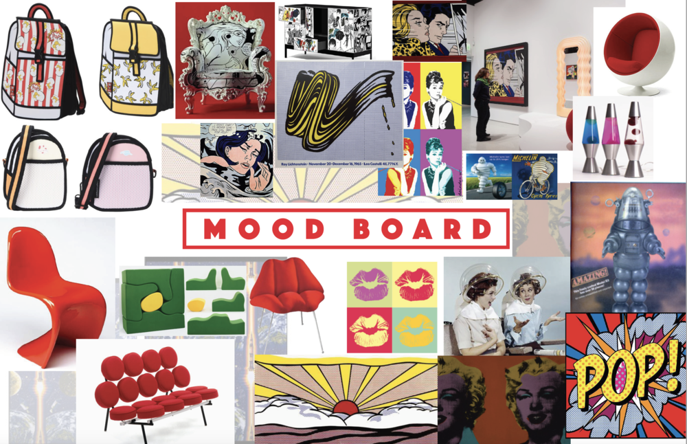
Mood Boards & Inspiration

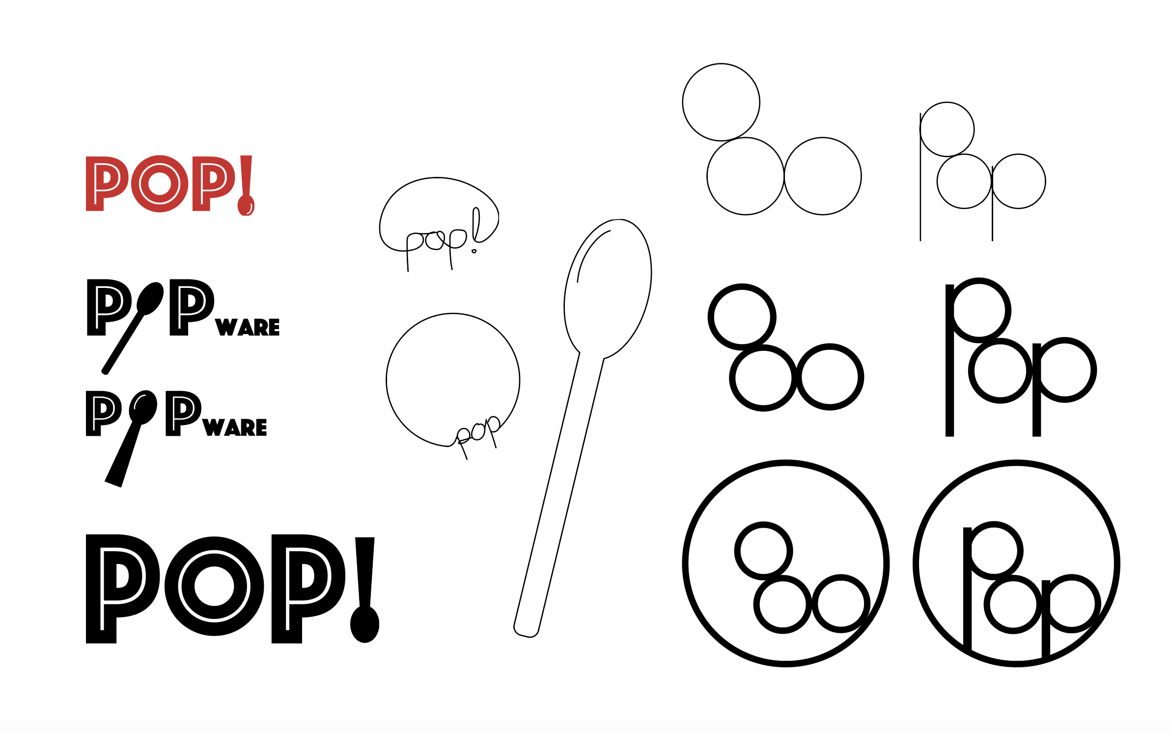
Logo Design
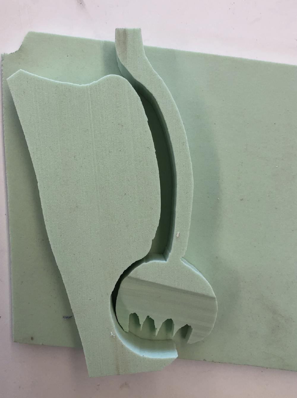
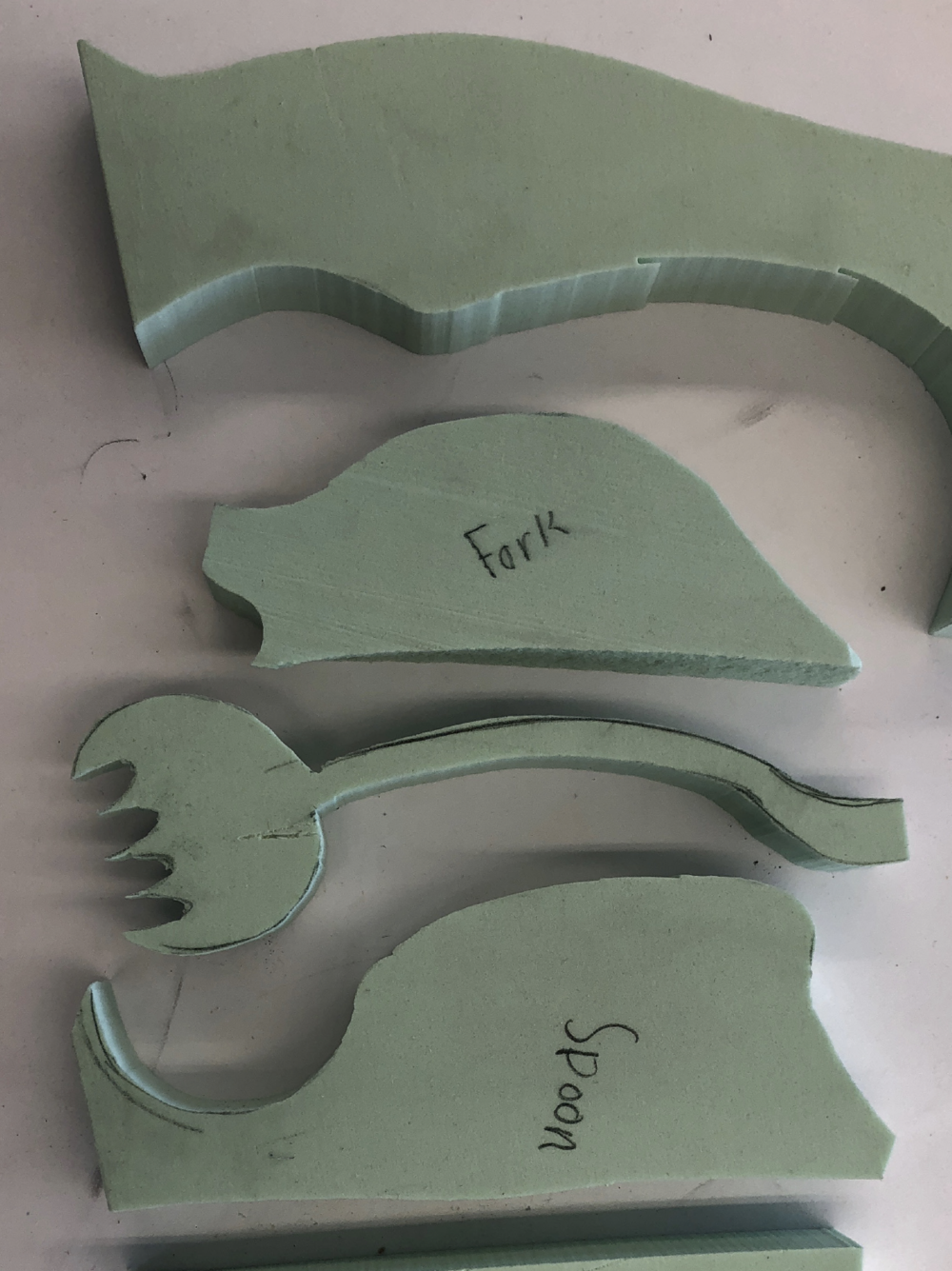
Process Pictures
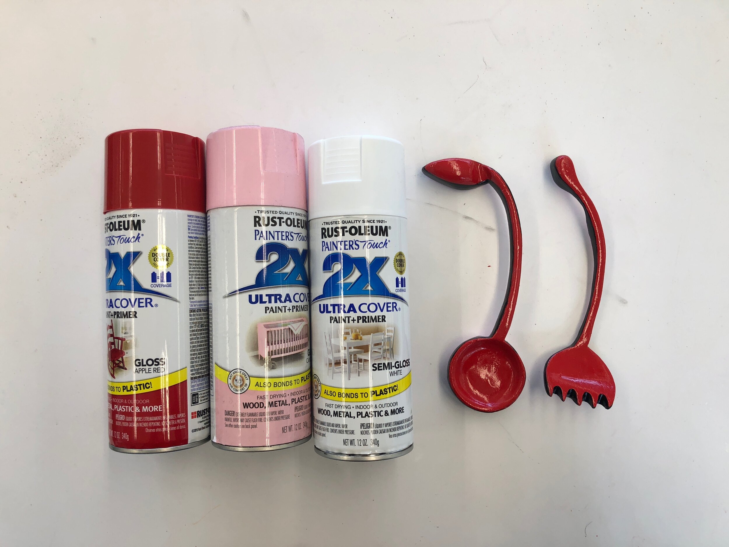
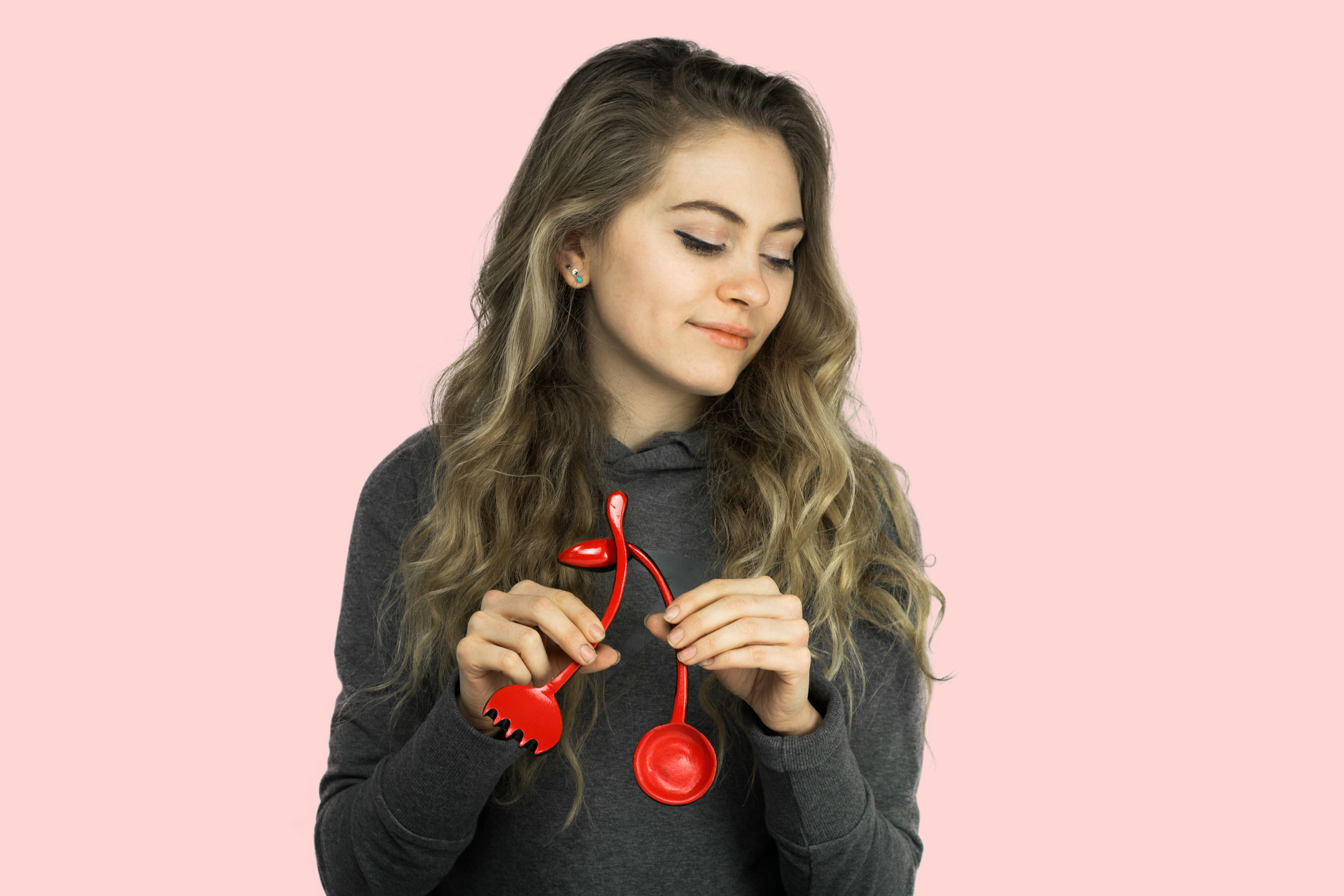
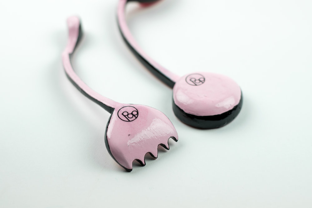
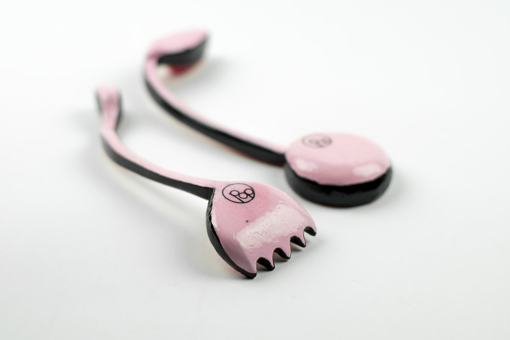
Hi-Fidelity Prototype: Cherryware Fork and Spoon Set by POPware
Colorful. Playful. Engergetic. These are just a few words to describe Popware’s fun dining utensils: Cherryware. Bold colors, sustainable bioplastic materials, and glossy finishes make Cherryware comfortable to hold and visually intruiging. The shape of the fork and spoon might just look like curvilinear forms, but put the handles together and a pair of cherries appears! The cartoon-like Cherryware utensils are the perfect addition to a family meal, friendly picnic, or school lunch!
About POPware
POPware is a kitchenware brand with a desire to cultivate little bits of joy and fun into everyday life. Our mission is to design everyday products that can be happily enjoyed by people of all backgrounds. POPware products encompass the retro pop design appeal reminiscent of the 60’s, yet a fun, approachable aspect that can be loved by all generations. Cherry-shaped silver wear, brightly colored whisks and spatulas, comic book style chopsticks… young and old alike can appreciate the humorous, cheerful nature of POPware products. At POPware, we believe everyday products should be affordable, well made, easy to use, and fun! Values
Sustainable. Inclusive. Playful.Our Target Consumer
People of all demographics, backgrounds, and generations. POPware fits an affordable price range. Retro 60s designs appeal to the nostalgic consumer, while the bright colors and fun shapes will draw the attention of young children.
Color
The top of the utensils is Cherryware Red(C=0,M=100,Y=89,K=0) and the bottom is POP Pink (C=0,M=40,Y=17,K=0). Thick black lines on the sides of the utensils outline the products and reference comic book style art.
Material
Just as the pop design of the 60s was focused on being new and revolutionary, Popware is too. A current focus in design is sustainabilty. Cherryware trades the not-so-environment-friendly plastics of pop design era in favor of new, sustainable bioplastics made from materials like corn starch. Although these hi-fi prototypes are made of sign foam, real Cherryware utensils would be constructed out of bioplastics.
Finish
Pop design is not subtle. It steals the show and shines. Cherryware follow suit with a high gloss finish. A glossy finish provides a smooth texture and shiny look. Bold colors and glossy finishes give Cherryware a fun, appealing feel and look.If you have questions regarding any specifics of this project, please contact me.